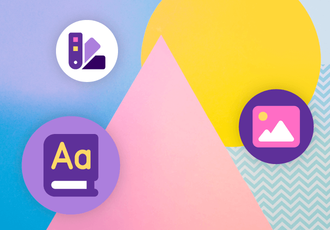
7 Visual design tips for new eLearning designers

A few weeks ago, we offered our 10 design tips for new instructional designers. Here, we extend that offering to the visual design of your online training.
The best training content in the world won’t be effective if it is visually unappealing or the design is confusing and learners give up before absorbing the knowledge they need. Following these seven basic tips should de-clutter your designs and turn your eLearning into more appealing and effective training products.
1. Leave some white space
Cluttered visual design increases cognitive load and increases the likelihood that learners will get distracted or focus on the wrong thing. An open, airy design (paired with the next tip on hierarchy) directs the eyes and the focus to the most important and relevant element of the screen or page.
Use space to group elements or to separate content items that support different ideas. Space can add emphasis, too: A large, bold element with large margins of white space proclaims its importance — and grabs learners’ attention.
2. Create a clear visual hierarchy
Use consistently formatted headers, colors, and layout to create a visual hierarchy. Choose header styles that reinforce the hierarchy, with obvious differences in size, say, for different heading levels, and use consistent fonts and bolding to make headers easy to spot.
Bold or colored text will attract attention, as will larger elements on the page or screen. Use larger headers or images for your most important content elements. Place elements on the page in a way that guides learners through the information in a logical order.
Avoid confusion by limiting your hierarchy to two or three levels within a page or screen. This ties in with the first tip — if you find yourself trying to squeeze in additional layers of content, take a step back. Reduce the amount of content on the page — perhaps even moving the less-important material to a linked reference rather than including deep detail in the core training.
3. Repeated elements create unity

Repeating elements within a screen or page ties things together and helps create a visual flow. Repeating elements throughout your online training course helps with navigation and flow in a bigger-picture way by tying together content in different sections of the course. For example, using a consistent icon to signify a tip or a linked resource creates unity across the course, while also making it easy for learners to scan for these helpful nuggets.
Repeated elements can reinforce your visual hierarchy (tip #2); for instance, consistently formatted headers at different levels that use text in the same font and weight but of different sizes both tie the content together and indicate which is more important or “comes first” in the processing order. Or, you can use a repeated graphical element to help learners identify content that fits into the same category, such as definitions of core concepts or mini-scenarios that allow learners to practice applying the information covered.
4. Choose your typeface carefully
The size and appearance of your text strongly influences learners’ success — choosing a beautiful but hard-to-read font increases cognitive load and makes your content less accessible to learners. A clear font aids learners’ progress — and ensures your courses meet accessibility standards. In most eLearning designs, you’ll want to stick with one or two fonts to avoid visual clutter and to ensure that your visual hierarchy and flow are easy for learners to follow.
The size of your text is an additional consideration. Larger type signifies importance and draws attention. Your design should include visual differences in size between main section headings, sub-headings, and body type. When choosing the size for headers and body text, consider that readers may be using a small screen, so choose fonts that remain legible when scaled down, and set your default size for body type at a size that is legible to learners with middle-aged eyes as well as to those with perfect vision. Finally, when creating digital materials, consider allowing learners to enlarge the text, as this makes your content more accessible.
5. Use colors to add impact and visual cues
A splash of color adds emphasis, draws attention, makes an element more memorable — it’s a valuable aid in creating and enforcing a visual hierarchy. But don’t overdo it; too much color creates chaos, as the learner doesn’t know which element to focus on first. Color can also communicate important information, such as a button that changes color when when the user is hovering over it or when it has been selected. These cues aid learners in navigating through the training.
Be aware of the emotional impact of colors when choosing your palette: A warm palette featuring reds, yellows, and oranges will affect learners differently from a predominantly cool blue- and green-hued design.
Many designs include a dominant color and one or more accent colors. Choose colors that have high contrast when selecting, say, a background color and a text color or a color for emphasis. High-contrast color pairs are more usable for most learners, which reduces cognitive load and improves accessibility.
6. Make every image count
Many learners pay more attention and retain online training content better if text is presented along with visual images. That’s not a license to fill every screen or page with images though: Every image you use should add meaning and enhance the learning content.
With an attractive visual design, decorative images can be kept to a minimum. Select graphical elements that support the content and reinforce its message, but avoid intricate graphics that increase cognitive load and distract learners without augmenting the teaching.
Use charts and graphs to present data; columns and paragraphs full of numbers do a poor job of telling the data story and are likely to put learners to sleep. Do add an explanation of the trends and points made in the charts, though, to increase the accessibility of your content — and of course include alt text descriptions with every image.
When illustrating your eLearning, seek out images that show diversity and capture the essence of your content. Your eLearning designs should reflect your learner population as well as modeling the accessible, inclusive organization you represent.
7. Above all, keep it simple
An open, clean design includes only the elements needed to present the materials and enable learners to understand them. Clutter includes excessive use of decorative images and animations, a cacophony of colors or fonts — and excess text that offers far more detail than learners need. Be wary of animations: There’s no need to have the text for each bullet spin and dance its way onto the screen, for example. Paring down your design to the basics reduces cognitive load while also contributing to a visually appealing and inviting eLearning course.
Learning Hub: free resources for eLearning
The Neovation Learning Hub contains many free resources and articles that can help you improve eLearning outcomes at your organization. Continue learning about Custom eLearning Development topics, brush up on Digital Accessibility, or find new tools to help you with your eLearning initiatives.


-svg.svg)
-svg.svg)
-svg.svg)
-svg.svg)